-
Here’s an interesting change of pace for you! This week, I was commissioned to design a series of logos for Gardena High School. The comprehensive high school is dividing itself into four Small Learning Communities , or SLCs (the big trend in secondary education today!), and one of the requirements is that each school find a way to visually identify itself. This is usually done through some kind of logo or branding.
Since the SLCs are sort of like mini-schools that operate under the umbrella of the larger school and campus, the logos should have some unifying elements and some elements that set them apart from each other. Each should reflect the SLC’s theme and course of study.
So, given these overall guidelines, I set out to create four distinct logos, one for each of the following SLCs:
- SHAPS – Sports medicine, Health, And Public Service
- ACCER – Architecture, Construction, Computers, Engineering, Robotics
- CALS – Creative Arts and Liberal Studies
- Green House – for incoming Freshmen students
I unified the designs by housing each one inside a giant “G” (for Gardena) and by keeping the outer ring of text and color the same. Within that outer frame, each design reflects the unique offerings of that SLC. Here’s what I put together:
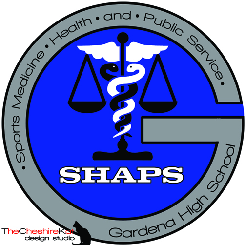
Logo design for SHAPS; I incorporated the caduceus for Sports Medicine/Health and the scales for Public Service.
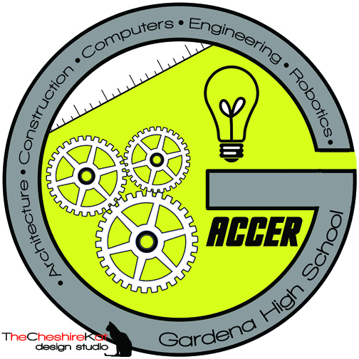
Logo Design for ACCER - the gears, ruler, and light bulb can all be relevant in the different fields of Architecture, Construction, Computers, Engineering, and Robotics.
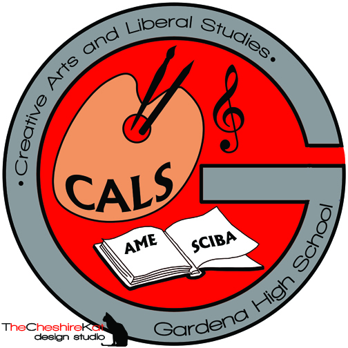
Logo Design for CALS - since this SLC also includes two smaller SLCs (AME and SCIBA), I listed those on the pages of the open book.
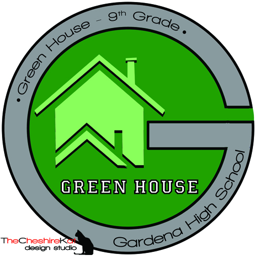
Logo Design for Green House - this SLC was already designated and implemented prior to the formation of the others, and its focus is on preparing the incoming 9th grade class for success throughout high school.
Thanks, Gardena High, for giving me the opportunity to create these for you!
*Edit* – Thanks to copious amounts of Russian spam, comments on this blog post are now disabled. Please feel free to email me with any comments, questions, or suggestions.
Logo Design – Gardena High School


2 Responses and Counting...
Those are awesome! I like that it’s the same overall one, but with different inner elements and color schemes!
your collection really awesome i liked your overall performance.